Review: WIRED for iPad
Print media is in trouble. I see it in the eyes of solicitors trying to get me to subscribe to the paper. Their selling point completely rests on coupons you can get in the Sunday paper. Never mind the great stories, sleuthing, or anything else related to the content. It’s all about the coupons. I get nearly all my news online (even local news) for free, so I need to get a newspaper subscription for the coupons? I can get those online, too. So when WIRED released a promo video showing off what they had in mind for a tablet device, things looked like they were going to be on the up and up, a way out of the death spiral that print media is currently in. Today WIRED released that app.
I showed it off to a lot of co-workers and the consistent response I got was: Wow. This is the way to read a magazine.
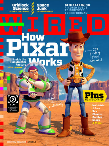
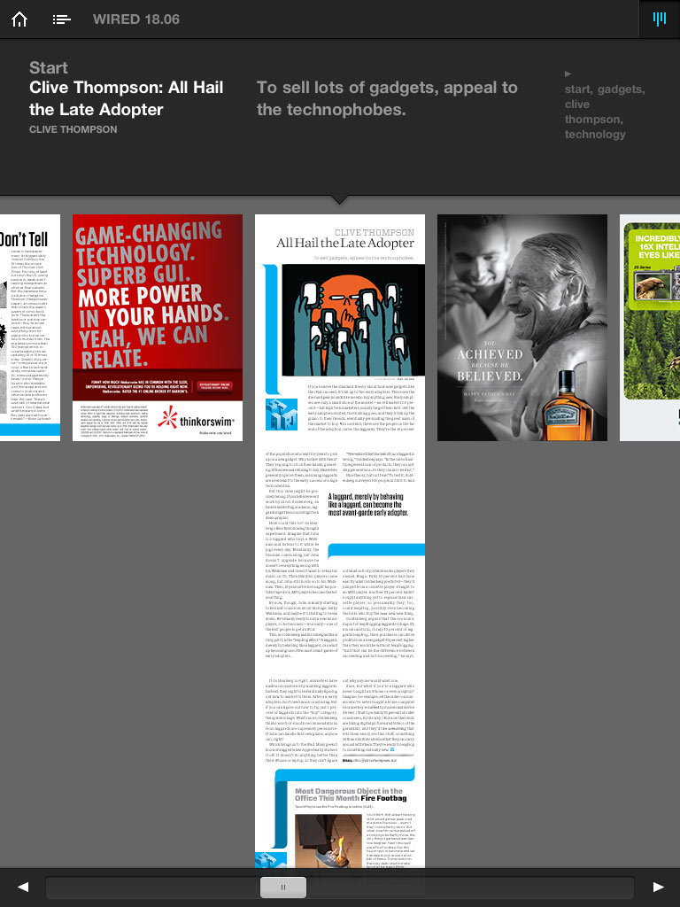
One of the pet peeves I have about most magazines is that they feature a few headline articles to draw you in. They don’t print the page on which the article is found and they make it damned near impossible to track it down. What’s great about the digital media is you can tap right on the headline and it takes you straight there. Ahhhhhh.... That in and of itself is pure magazine heaven. This issue focuses on the up and coming release of Toy Story 3, so they even included a video of an ‘exclusive’ clip from the movie. The kids latched onto that pretty quick.
One of my other curiosities included how they did layouts. Because a device like the iPad puts you in control of orientation, I wondered how well an eZine adapted to a multi-layout possibility. I was greatly surprised at how well it worked. In fact, they even exceeded my expectations. Instead of creating a portrait layout and making you scroll if you take it landscape, they actually do two completely distinct layouts. The same content is on the page, it’s just arranged in a way that suits the orientation in which you are viewing it. (Click the images below to get a look).
True to the demo video that WIRED produced with Adobe, some of the ads are somewhat interactive, while others are as static as the printed ones. What I got a kick out of was the inclusion of ads that knew that you are going to be viewing them on the iPad:

The other killer feature is navigation. You can consume the media from virtual cover to cover in a normal fashion, or you can use a number of ways to navigate the content. First, in the conventional manner, you can swipe left to right to consume the media in a linear fashion. Second, you can ‘scrub’ the pages by tapping on the page and use a slider on the bottom to quickly move between pages:
Next, you can tap a window that will go into a full screen scrub mode to get a bigger view:
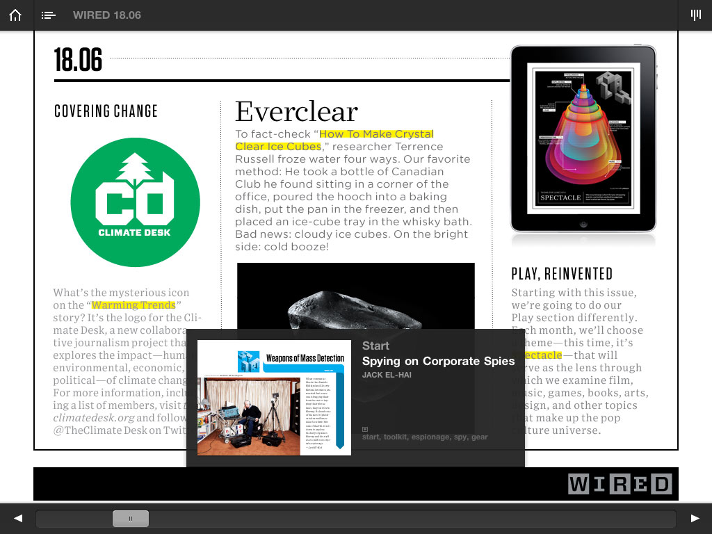
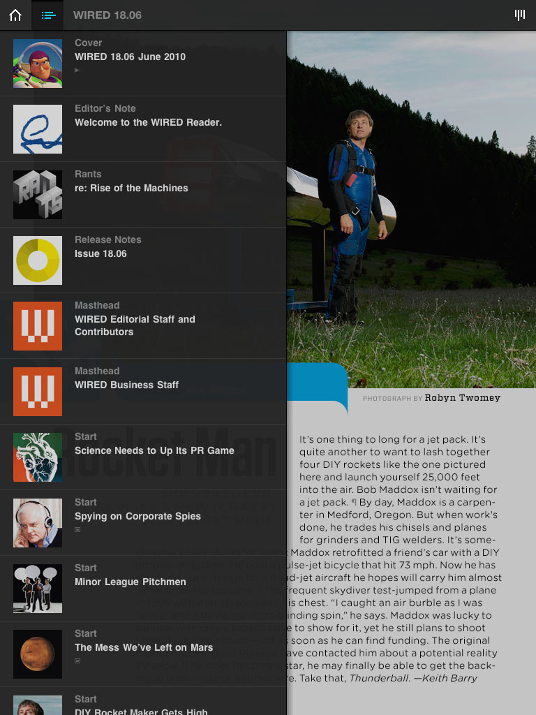
Lastly, there is (yet) another mode where it brings up a listing of all the articles that functions as a table of contents:
While the app itself is a joy to consume, I judge there to be a few missing capabilities. First of all, there is no pinch to zoom. WIRED is notorious for using smaller typefaces in their publication and their eZine is no exception. This is a capability that is natural to those using the iPad (or iPhone for that matter) that it is a constant frustration. I don’t know what is ‘under the hood’ as far as the app is concerned, but something tells me that I am looking at (in some cases) a rasterized image instead of real text. Very disappointing.
Along that same hunch, I cannot select any text in the articles. So, for example, if I wanted to pull a quote out and tweet about it, SOL. To add insult to injury, many of these advertisements want to take me to a website, so instead of popping a browser window right there in the app, they want to drag me out of the app (kicking and screaming!) and into Safari to view the content. Fat chance. WIRED really dorked this one up because I am totally willing to go view some advertising content if you didn’t break the (mostly) seamlessness of the app.
Lastly, you navigate through an article by swiping up and down. This is pretty cool, except there is no indicator that an article/advertisement/etc. has additional content. The app has me constantly trying to swipe down to find the hiding content and it’s a source of frustration when there’s nothing there. It would have been much better if there were a standard visual indicator for additional content.
In the end, WIRED has done well in partnering with Adobe on creating a strong format for digital magazines. Shore up the deficiencies in the first iteration and we’ll have a situation that WIRED is hoping for:
"We also think it's an opportunity to reset the economics. For the first time people may value this experience so much that they'll pay for it."
At $5 bucks a pop, that’s a lot of ground to make up. I’m not sure if the experience was so mind blowing that I’d plunk down five bucks per issue, but if nothing else you ought to purchase this first issue just to experience the possibilities.
P.S. Since this app has Adobe’s stink all over it, will WIRED run into problems with Apple putting the kibosh on Flash-based apps in the future???